Menu

#615 Menu item calendar

Parent Category:
DPCalendar
Category:
Menu items
Last Updated:
Allon Moritz, Tuesday, 07 November 2023 13:26
Created:
Wednesday, 22 February 2012 10:15
Hits:
20005

DownloadPHP 7.4PHP 8Joomla 3.10Joomla 4.4Joomla 5

Introduction

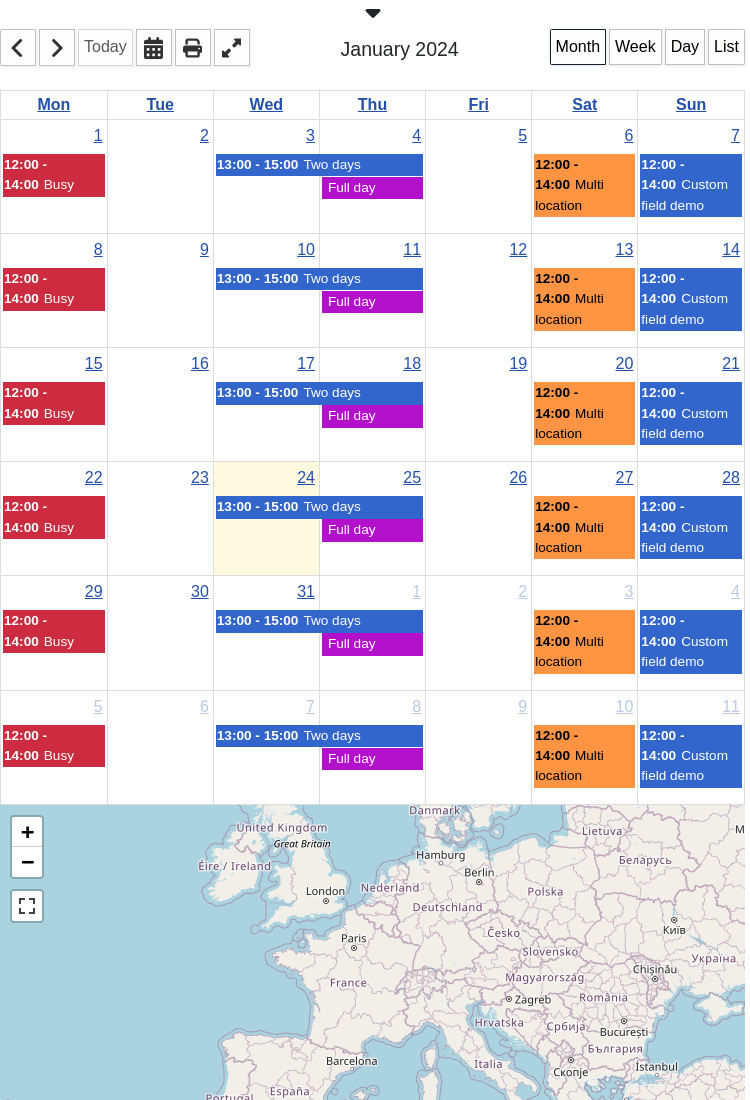
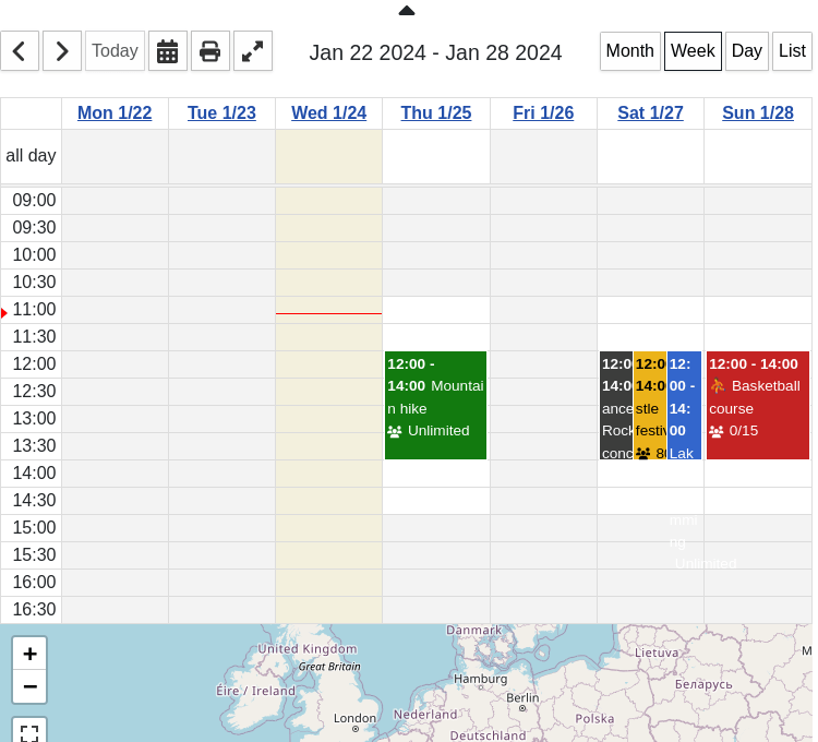
The Calendar menu item shows the default DPCalendar Joomla calendar. It is a javascript powered calendar application which loads it's event trough ajax requests for a fast page load and to not force a site refresh when navigating around in the calendar. It comes with tons of configuration options to adapt it perfectly to your web site. The site admin can define the options on a per menu item level or globally in the DPCalendar options.

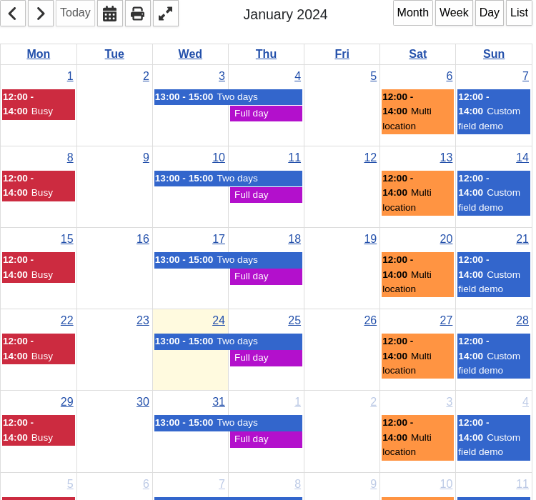
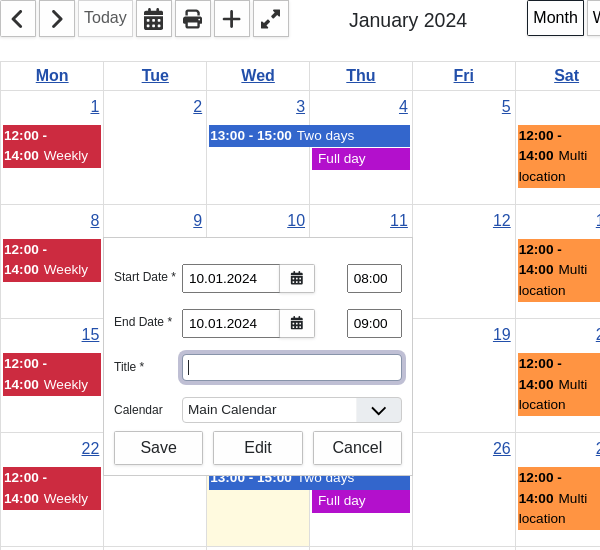
The Joomla calendar has four different views -month, week, day and list, which are showing your events in different grids. On the top of every view is the calendar toolbar which allows you to navigate within the calendar view. It is possible to navigate back and forth in the view or to jump to a certain date through a compact date picker. For those who like to print out the calendar, we have an optimized print view, which can be opened directly through the print button. Beside the quick edit form, the admin can also create new events with the + button, which opens an event form page.

Map

The map below the calendar show the events from the current view based on their locations. If there are multiple events on close locations or even on the same location, then a cluster is shown which shows an icon about how many events do appear on that spot. Clicking on the cluster icon will expand the events where the visitor can click on them to show their info popup.

How to setup the map providers and more is documented in the maps Introduction article.

Calendar menu item

Calendar list

Above the calendar view is a list of calendars which are shown on the actual page. Initially the list is hidden and can be expanded by clicking the arrow button. There is an option to define the initial state of the list if it should be shown closed or expanded or even hidden for the visitor. The calendars can be deselected to show only events of the calendars the visitor wants. For every calendar is an Ical Url available to download the calendar as .ics file. The Subscribe link offers the possibility to subscribe to the event through an application which supports the webcal protocol. If the visitor is logged in, then a private ical url will be shown (when the token is generated in the profile) and a CalDAV url to access the calendar from any CalDAV device.

Calendar menu item list

Month view

The month view displays a full month of events where each cell represents a day. When clicking on a day number, it navigates you to the view of the respective day. If needed the week numbers can be displayed too.

Calendar menu item month

Week view

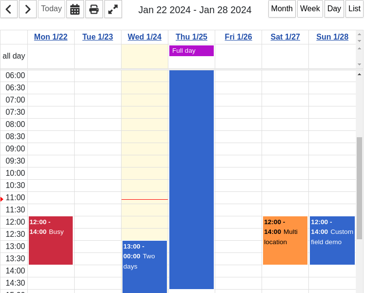
The week view displays a whole week of events where each column represents a day. The rows of such a column do define the hour of the day where the event happens. If there are all day events, then they will be displayed on the top of every day. Clicking on a day number, then it navigates you to the day view of the respective day.

Calendar menu item week

Day view

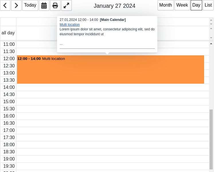
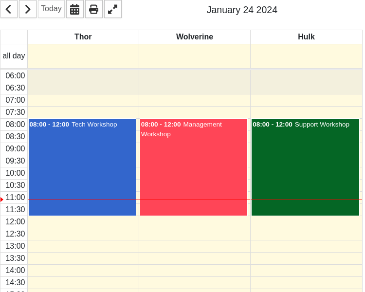
The day view displays a whole day of events as a single column. The rows of such a column do define the hour of the day where the event happens. If there are all day events, then they will be displayed on the top of every day. This view fits best as multi resource view because there is a lot of space available.

Calendar menu item day

List view

The list view displays a list of events where each row represents an event, grouped together per day. Clicking on a date in the day header, then it navigates you to the day view of the respective day. In the calendar options can be the date span defined, the list should show and jump when a navigation button is clicked.

Calendar menu item list

Business time

With the business hours and days setting you can indicate when your store is open. The calendar highlights the closed days and hours with a grey background. If you want to change the color, use your own CSS and the selector

.com-dpcalendar-calendar__calendar .fc-nonbusiness {
    background-color: green; 
}
Calendar menu item business hours

Location rooms

If you have enabled a location filter in the DPCalendar options and assigned some views to show resources in, then the calendar can show columns with the location or the different rooms. You can also assign an event not only to a resource but also to a specific room. Means the event will then appear in that room only on the resource column for this room.

Calendar menu item rooms

Quick add

If you click in a day cell and have the create event permission, then a quick add dialog is opened where the author can quickly create an event on the date of the selected cell.

Calendar menu item quick add

Tooltip

When the user moves it's mouse over an event, a tooltip pops up which displays some details of the event and shows some quick links to common actions. We are using the tippy.js library which has a small footprint and zero dependencies, except to popper.js.

Style the tooltip

To override the styles of the tooltip library you can add the selector .tippy-content to reference the elements. For example to change the background you can add the following code snippet into your custom.css (or whatever your template offers to add custom code).

.tippy-content{
    background-color: blue;
}

Change the tooltip

It is very likely that you want to adapt the output of the tooltip. To achieve that you have to create a layout override by coping the file /components/com_dpcalendar/layouts/event/tooltip.php to /templates/{{your template}}/html/layouts/com_dpcalendar/event/tooltip.php. Then change the file contents in your template according to your needs.

For example, if you want to increase the description length in the popup to 365, then change the line 47 to:

<?php echo Joomla\CMS\HTML\HTMLHelper::_('string.truncate', $event->description, 100); ?>

Remove tooltip

To completely remove the tooltip from the component calendar make a tooltip override as described above and empty the file /templates/{{your template}}/html/layouts/com_dpcalendar/event/tooltip.php.

Filters

In the calendar menu item the admin can set different filters for the events to display only what is needed.

Author filter

When filtering for an author, then only events of a given user are shown within the calendar. There is a special "My" option available which displays only events of the current logged in user.

Location filter

A filter to display only events from the selected locations.

Tags filter

A filter to display only events from the selected tags. Tags can be set while editing an event.

Options

The settings can be configured globally in the DPCalendar options or per menu item. If the value is empty in the menu item, then it will be inherited from the global options.

Show Calendar List [Type: List] [Default: Yes]
The state of the calendar list on top of the calendar area.
The following options are available:
  1. Yes
  2. Yes and expand
  3. No
Default View [Type: List] [Default: Month]
The view which is shown when clicking the first time on a link.
The following options are available:
  1. Month
  2. Week
  3. Day
  4. List
First Weekday [Type: List] [Default: Monday]
The starting day of the week in the calendar.
The following options are available:
  1. Sunday
  2. Monday
  3. Tuesday
  4. Wednesday
  5. Thursday
  6. Friday
  7. Saturday
Show Weekend [Type: Radio] [Default: Yes]
Shows or hides Saturday and Sunday, allowing a 'wider' view of weekdays.
The following options are available:
  1. Yes
  2. No
Fixed Week Count [Type: Radio] [Default: Yes]
Determines the number of weeks displayed in a month view. If true, the calendar will always be 6 weeks tall. If false, the calendar will have either 4, 5, or 6 weeks, depending on the month.
The following options are available:
  1. Yes
  2. No
Show Week Number [Type: Radio] [Default: No]
Shows the week number.
The following options are available:
  1. Yes
  2. No
Overlap Events [Type: Radio] [Default: Yes]
Overlap events in the week or day view.
The following options are available:
  1. Yes
  2. No
Time Slot Week/Day View [Type: Text] [Default: 30]
The frequency for displaying time slots, in minutes in the week and day view.
Calendar Height [Type: Text]
The height of the calendar area. Please set only a numeric value without 'px' or '%' at the end. If set to 0 it will be automatically computed.
Event Limit [Type: Text]
Limits the number of events displayed on a day. If the value is 2 and when there are 4 events, a link that looks like '+2 more' is displayed. An empty value (default) will limit the number of events to the height of the day cell. -1 means the feature is disable.
Title Format Month [Type: Text] [Default: F Y]
The format of the title in the month view (check http://www.php.net/date for details).
Title Format Week [Type: Text] [Default: M j Y]
The format of the title in the week view (check http://www.php.net/date for details).
Title Format Day [Type: Text] [Default: F j Y]
The format of the title in the day view (check http://www.php.net/date for details).
Title Format List [Type: Text] [Default: M j Y]
The format of the title in the list view (check http://www.php.net/date for details).
Time Format Month [Type: Text] [Default: H:i]
The format of the time in the month view (check http://www.php.net/date for details).
Time Format Week [Type: Text] [Default: H:i]
The format of the time in the week view (check http://www.php.net/date for details).
Time Format Day [Type: Text] [Default: H:i]
The format of the time in the day view (check http://www.php.net/date for details).
Time Format List [Type: Text] [Default: H:i]
The format of the time in the list view (check http://www.php.net/date for details).
Column Format Month [Type: Text] [Default: D]
The format of the column in the month view (check http://www.php.net/date for details).
Column Format Week [Type: Text] [Default: D n/j]
The format of the column in the week view (check http://www.php.net/date for details).
Column Format Day [Type: Text] [Default: l]
The format of the column in the day view (check http://www.php.net/date for details).
Column Format List [Type: Text] [Default: D]
The format of the column in the list view (check http://www.php.net/date for details).
Axis Format Month [Type: Text] [Default: l j]
The format of the axis in month view.
Axis Format Week [Type: Text] [Default: H:i]
The format of the axis in week view.
Axis Format Day [Type: Text] [Default: H:i]
The format of the axis in day view.
Day Format List [Type: Text] [Default: l]
The format of the day in the list view (check http://www.php.net/date for details).
Date Format List [Type: Text] [Default: F j, Y]
The format of the date in the list view (check http://www.php.net/date for details).
List Range [Type: Text] [Default: 30]
The amount of days the list should display events.
Show Navigation [Type: Radio] [Default: Yes]
Should the navigation be shown.
The following options are available:
  1. No
  2. Yes
Show Datepicker Button [Type: Radio] [Default: Yes]
Should the datepicker button be shown.
The following options are available:
  1. No
  2. Yes
Show Today Button [Type: Radio] [Default: Yes]
Should the today button be shown.
The following options are available:
  1. No
  2. Yes
Show Print Button [Type: Radio] [Default: Yes]
Should the print button be shown.
The following options are available:
  1. No
  2. Yes
Show Create Button [Type: Radio] [Default: Yes]
Should the create event button be shown.
The following options are available:
  1. No
  2. Yes
Show Fullscreen Button [Type: Radio] [Default: Yes]
Should the fullscreen button be shown.
The following options are available:
  1. No
  2. Yes
Show Title [Type: Radio] [Default: Yes]
Should the title in the header between the buttons be shown.
The following options are available:
  1. No
  2. Yes
Show Month Button [Type: Radio] [Default: Yes]
Should the month button be shown.
The following options are available:
  1. No
  2. Yes
Show Week Button [Type: Radio] [Default: Yes]
Should the week button be shown.
The following options are available:
  1. No
  2. Yes
Show Day Button [Type: Radio] [Default: Yes]
Should the day button be shown.
The following options are available:
  1. No
  2. Yes
Show List Button [Type: Radio] [Default: Yes]
Should the list button be shown.
The following options are available:
  1. No
  2. Yes
Content Before [Type: Textarea]
This text will be displayed before the component output (can contain HTML and supports content plugins).
Content After [Type: Textarea]
This text will be displayed after the component output (can contain HTML and supports content plugins).
Open Event [Type: List] [Default: Full Page]
How the event should be opened.
The following options are available:
  1. Full Page
  2. Modal
  3. Disabled
Modal Width [Type: Text]
If the event is shown in a modal the width can be defined here.
Modal Height [Type: Text]
If the event is shown in a modal the height can be defined here.
Quick Create Event [Type: List] [Default: Open Quick Add Popup]
When the user clicks on a day and has create rights, should a quick add popup be displayed, directly the event edit form opened or nothing be done.
The following options are available:
  1. Disabled
  2. Open Quick Add Popup
  3. Go To Form View
Description Limit [Type: Text] [Default: 100]
Specify how much text will be be displayed from the event description. Empty means unlimited.
Adjust FG Colour [Type: List] [Default: Black White]
Adjust the foreground text colour of the event title.
The following options are available:
  1. No
  2. Inverse
  3. Black White
Show Map [Type: List] [Default: Yes]
Should a map be shown under the calendar.
The following options are available:
  1. No
  2. Yes
  3. Yes, without print view
Map Zoom [Type: Text] [Default: 4]
The initial zoom level of the map.
Map Width [Type: Text] [Default: 100%]
The width of the map.
Map Height [Type: Text] [Default: 350px]
The height of the map.
Map Latitude [Type: Text] [Default: 47]
The initial latitude of the map.
Map Longitude [Type: Text] [Default: 4]
The initial longitude of the map.
First Hour [Type: Text] [Default: 6]
The first hour that will be visible in the scroll pane. Values must be from 0-23, where 0=midnight, 1=1am, etc.
Min Time [Type: Text]
The first hour/time that will be displayed, even when the scroll bars have been scrolled all the way up. This can be a number like 5 (which means 5am), a string like '5:30' (which means 5:30am) or a string like '5:30am'.
Max Time [Type: Text] [Default: 24]
The last hour/time (exclusively) that will be displayed, even when the scroll bars have been scrolled all the way down. This can be a number like 22 (which means 10pm), a string like '22:30' (which means 10:30pm) or a string like '10:30pm'.
Show Current Time Indicator [Type: Radio] [Default: Yes]
Show the current time indicator as line.
The following options are available:
  1. Yes
  2. No
Hidden days [Type: List]
The hidden days.
The following options are available:
  1. Monday
  2. Tuesday
  3. Wednesday
  4. Thursday
  5. Friday
  6. Saturday
  7. Sunday
Business Hours Start [Type: Text]
The start time of your business, eg. 08:00:00.
Business Hours End [Type: Text]
The end time of your business, eg. 17:00:00.
Business Days [Type: List]
The days your business is open.
The following options are available:
  1. Monday
  2. Tuesday
  3. Wednesday
  4. Thursday
  5. Friday
  6. Saturday
  7. Sunday
Default List View Screen Size [Type: Text] [Default: 500]
When the screen size is smaller than the value in pixels it will default to the list view, when a visitor is the first time on the page.
Start Date [Type: Text]
The start date like 2022-08-18 or can be relative to now like '+1 month'.
Filter Author [Type: Dpauthor] [Default: None]
Filters events by author. If my is set, then only events from the currently logged in user are shown.
The following options are available:
  1. My
  2. None
Filter Locations [Type: Location]
Only show events for the given locations. If empty, the filter has no influence.
Resource Views [Type: List]
The views which will show the locations as resources.
The following options are available:
  1. Week
  2. Day
Filter Tags [Type: Tag]
Only show events for the given tags. If empty, the filter has no influence.
Custom CSS [Type: Textarea]
Custom CSS code which will be added to the HTML document.

Comments (0)

We use cookies on our website. Some of them are essential for the operation of the site, while others help us to improve this site and the user experience (tracking cookies). You can decide for yourself whether you want to allow cookies or not. Please note that if you reject them, you may not be able to use all the functionalities of the site.