Menu

#622 Mini Module

Parent Category:
DPCalendar
Category:
Modules
Last Updated:
Allon Moritz, Wednesday, 20 December 2023 10:55
Created:
Friday, 14 September 2012 22:23
Hits:
13592

DownloadPHP 7.4PHP 8Joomla 3.10Joomla 4.4Joomla 5

Introduction

The Mini Module shows a the main calendar at a module position. If you click on a day which has events booked in, you will be navigated to the day view of your Joomla calendar so that you are able to view the details of the events for that day.

The module has the same options as the calendar menu item to adapt it perfectly to your web site.

Mini module

Compact mode

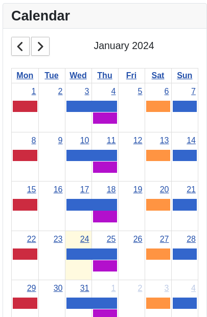
The "Compact events" setting allows to render the events in different modes within the calendar:

  1. Setting No
    This mode displays every event with title and color. Similar to what the Menu item calendar does.
  2. Setting Single
    This mode displays every event without the title but with the color. The screenshot above is taken in that mode.
  3. Setting Yes
    In compact mode are all events of that day collected together and the cell in the calendar is fully displayed with the event color property from the settings.
Mini module compact mode

Multiple months

The mini module has a start date parameter where the admin can set a fixed start date like "2020-06-14". It supports also relative dates like "+1 month". Like that you can place multiple modules in the same article through {loadposition} to make a full year view.

Quick add

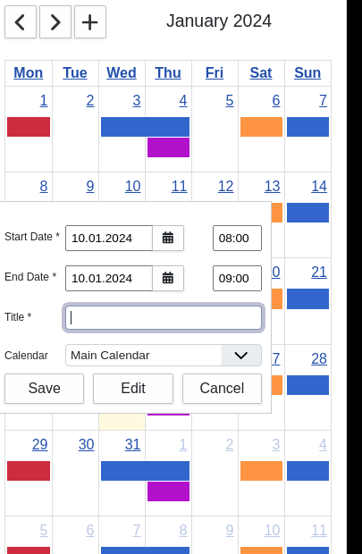
If you click in a day cell and have the create event permission, then a quick add dialog is opened where the author can quickly create an event on the date of the selected cell.

Calendar module quick add

Filters

In the counter module the admin can set different filters for the events to display only what is needed.

Author filter

When filtering for an author, then only events of a given user are shown within the calendar. There is a special "My" option available which displays only events of the current logged in user.

Location filter

A filter to display only events from the selected locations.

Tags filter

A filter to display only events from the selected tags. Tags can be set while editing an event.

Options

Select Calendars [Type: Dpcalendar]
The calendars which should be pre selected. All subcalendars will be included as well also when deselected.
Compact events [Type: List] [Default: Single]
Should all the individual events or only a compact day summary be displayed. Single means that the individual events are displayed but in a compact format.
The following options are available:
  1. Yes
  2. Single
  3. No
Event Color [Type: Color] [Default: Classes for past and future eventsCAE]
The color of the days with events.
View To Open [Type: List] [Default: Day]
The view to open the events with.
The following options are available:
  1. Month
  2. Week
  3. Day
  4. List
The default view [Type: List] [Default: Month]
The view which is shown when clicking the first time on a link.
The following options are available:
  1. Month
  2. Week
  3. Day
  4. List
Week starts on [Type: List] [Default: Monday]
The starting day of the week in the calendar.
The following options are available:
  1. Sunday
  2. Monday
  3. Tuesday
  4. Wednesday
  5. Thursday
  6. Friday
  7. Saturday
Show weekend events [Type: Radio] [Default: Yes]
Shows or hides Saturday and Sunday, allowing a 'wider' view of weekdays.
The following options are available:
  1. Yes
  2. No
Fixed Week Count [Type: Radio] [Default: Yes]
Determines the number of weeks displayed in a month view. If true, the calendar will always be 6 weeks tall. If false, the calendar will have either 4, 5, or 6 weeks, depending on the month.
The following options are available:
  1. Yes
  2. No
Show week number [Type: Radio] [Default: No]
Shows the week number.
The following options are available:
  1. Yes
  2. No
Overlap events [Type: Radio] [Default: Yes]
Overlap events in the week or day view.
The following options are available:
  1. Yes
  2. No
Time Slot Week/Day View [Type: Text] [Default: 30]
The frequency for displaying time slots, in minutes in the week and day view.
Calendar height [Type: Text]
The height of the calendar area. Please set only a numeric value without 'px' or '%' at the end. If set to 0 it will be automatically computed.
Event Limit [Type: Text]
Limits the number of events displayed on a day. If the value is 2 and when there are 4 events, a link that looks like '+2 more' is displayed. An empty value (default) will limit the number of events to the height of the day cell. -1 means the feature is disable.
Title format month [Type: Text] [Default: F Y]
The format of the title in the month view (check http://www.php.net/date for details). {...} switches to formatting the 2nd date. [...] only displays the enclosed format if the current date is different from the alternate date in the same regards.
Title format week [Type: Text] [Default: M j Y]
The format of the title in the week view (check http://www.php.net/date for details).
Title format day [Type: Text] [Default: F j Y]
The format of the title in the day view (check http://www.php.net/date for details).
Title format list [Type: Text] [Default: M j Y]
The format of the title in the list view (check http://www.php.net/date for details).
Time format month [Type: Text] [Default: H:i]
The format of the time in the month view (check http://www.php.net/date for details). {...} switches to formatting the 2nd date. [...] only displays the enclosed format if the current date is different from the alternate date in the same regards.
Time format week [Type: Text] [Default: H:i]
The format of the time in the week view (check http://www.php.net/date for details).
Time format day [Type: Text] [Default: H:i]
The format of the time in the day view (check http://www.php.net/date for details).
Time format list [Type: Text] [Default: H:i]
The format of the title in the list view (check http://www.php.net/date for details).
Column format month [Type: Text] [Default: D]
The format of the column in the month view (check http://www.php.net/date for details).
Column format week [Type: Text] [Default: D n/j]
The format of the column in the week view (check http://www.php.net/date for details).
Column format day [Type: Text] [Default: l]
The format of the column in the day view (check http://www.php.net/date for details).
Column format list [Type: Text] [Default: D]
The format of the column in the list view (check http://www.php.net/date for details).
Axis Format Month [Type: Text] [Default: l j]
The format of the axis in month view.
Axis Format Week [Type: Text] [Default: H:i]
The format of the axis in week view.
Axis Format Day [Type: Text] [Default: H:i]
The format of the axis in day view.
Day format list [Type: Text] [Default: l]
The format of the day in the list view (check http://www.php.net/date for details).
Date format list [Type: Text] [Default: F j, Y]
The format of the date in the list view (check http://www.php.net/date for details).
List Range [Type: Text] [Default: 30]
The amount of days the list should display events.
Show Navigation [Type: Radio] [Default: Yes]
Should the navigation be shown.
The following options are available:
  1. No
  2. Yes
Show Datepicker Button [Type: Radio] [Default: No]
Should the datepicker button be shown.
The following options are available:
  1. No
  2. Yes
Show Today Button [Type: Radio] [Default: No]
Should the today button be shown.
The following options are available:
  1. No
  2. Yes
Show Create Button [Type: Radio] [Default: No]
Should the create event button be shown.
The following options are available:
  1. No
  2. Yes
Show Title [Type: Radio] [Default: Yes]
Should the title in the header between the buttons be shown.
The following options are available:
  1. No
  2. Yes
Show Month Button [Type: Radio] [Default: No]
Should the month button be shown.
The following options are available:
  1. No
  2. Yes
Show Week Button [Type: Radio] [Default: No]
Should the week button be shown.
The following options are available:
  1. No
  2. Yes
Show Day Button [Type: Radio] [Default: No]
Should the day button be shown.
The following options are available:
  1. No
  2. Yes
Show List Button [Type: Radio] [Default: No]
Should the list button be shown.
The following options are available:
  1. No
  2. Yes
Open Event [Type: List] [Default: Full Page]
How the event should be opened.
The following options are available:
  1. Full Page
  2. Modal
  3. Disabled
Modal Width [Type: Text]
If the event is shown in a modal the width can be defined here.
Modal Height [Type: Text] [Default: 500]
If the event is shown in a modal the height can be defined here.
Quick Create Event [Type: List] [Default: Open Quick Add Popup]
When the user clicks on a day and has create rights, should a quick add popup be displayed, directly the event edit form opened or nothing be done.
The following options are available:
  1. Disabled
  2. Open Quick Add Popup
  3. Go To Form View
Description limit [Type: Text] [Default: 100]
Specify how much text will be be displayed from the event description. Empty means unlimited.
Adjust FG Colour [Type: List] [Default: Black White]
Adjust the foreground text colour of the event title.
The following options are available:
  1. No
  2. Inverse
  3. Black White
Show Map [Type: Radio] [Default: No]
Should a map be shown under the calendar.
The following options are available:
  1. Yes
  2. No
Map Zoom [Type: Text] [Default: 4]
The initial zoom level of the map.
Map Width [Type: Text] [Default: 100%]
The width of the map.
Map Height [Type: Text] [Default: 350px]
The height of the map.
Map Latitude [Type: Text] [Default: 47]
The initial latitude of the map.
Map Longitude [Type: Text] [Default: 4]
The initial longitude of the map.
First Hour [Type: Text] [Default: 6]
The first hour that will be visible in the scroll pane. Values must be from 0-23, where 0=midnight, 1=1am, etc.
Min Time [Type: Text]
The first hour/time that will be displayed, even when the scroll bars have been scrolled all the way up. This can be a number like 5 (which means 5am), a string like '5:30' (which means 5:30am) or a string like '5:30am'.
Max Time [Type: Text] [Default: 24]
The last hour/time (exclusively) that will be displayed, even when the scroll bars have been scrolled all the way down. This can be a number like 22 (which means 10pm), a string like '22:30' (which means 10:30pm) or a string like '10:30pm'.
Show Current Time Indicator [Type: Radio] [Default: Yes]
Show the current time indicator as line.
The following options are available:
  1. Yes
  2. No
Hidden days [Type: List]
The hidden days.
The following options are available:
  1. Monday
  2. Tuesday
  3. Wednesday
  4. Thursday
  5. Friday
  6. Saturday
  7. Sunday
Business Hours Start [Type: Text]
The start time of your business, eg. 08:00:00.
Business Hours End [Type: Text]
The end time of your business, eg. 17:00:00.
Business Days [Type: List]
The days your business is open.
The following options are available:
  1. Monday
  2. Tuesday
  3. Wednesday
  4. Thursday
  5. Friday
  6. Saturday
  7. Sunday
Author Filter [Type: Dpauthor] [Default: None]
Filters events by author. If my is set, then only events from the currently logged in user are shown.
The following options are available:
  1. My
  2. None
Filter Locations [Type: Location]
Only show events for the given locations. If empty, the filter has no influence.
Resource Views [Type: List]
The views which will show the locations as resources.
The following options are available:
  1. Week
  2. Day
Filter Tags [Type: Tag]
Only show events for the given tags. If empty, the filter has no influence.
Default List View Screen Size [Type: Text] [Default: 500]
When the screen size is smaller than the value in pixels it will default to the list view, when a visitor is the first time on the page.

Options

Start Date [Type: Text]
The start date like 2022-08-18 or can be relative to now like '+1 month'.
Layout [Type: Modulelayout]
Use a layout from the supplied module or overrides in the templates.
Module Class [Type: Text]
Custom CSS [Type: Textarea]
Custom CSS code which will be added to the HTML document.

Comments (0)

We use cookies on our website. Some of them are essential for the operation of the site, while others help us to improve this site and the user experience (tracking cookies). You can decide for yourself whether you want to allow cookies or not. Please note that if you reject them, you may not be able to use all the functionalities of the site.